
You’ve decided on your new trade show display. Congratulations! But you’re not done yet. It’s time to design the graphics. Before you begin, remember that these graphics will be on a 3D structure, not a webpage or a paper brochure. Does your designer have experience with creating 4 ft. x 8 ft. lightbox graphics or graphics that extend across multiple panels or even creating appropriate designs for charging tables, counters, or hand sanitizer stands?
Most don’t… and that’s not a criticism. It’s a reality.
Getting Started with Trade Show Graphic Design
Graphic design on 3D structures is a specialized skill acquired by working on trade show booth graphics for years. And it’s not just technical skills, it’s knowing where to position text, how much text, and how graphics should flow across a wall with 90 degree returns or curves or even ceilings. It’s understanding how to use the white space effectively and where your logo should go (or not go).
You want AMAZING! And you deserve AMAZING. Consider working with a graphic designer with 3D experience. If that’s not possible, then follow these 10 tips when designing your trade show graphics.
10 Trade Show Graphic Design Tips & Considerations
1. Hire a Professional Graphic Designer.
Don’t wing it when it comes to graphic design. It’s too important. You invested thousands of dollars on a new display. Now take it to the next level with professional graphics. The kiss of death for any trade show exhibit is ill-conceived and poorly executed graphics. It’s the equivalent of working out to build 6 pack abs and then wearing an oversized sweatshirt. A professional graphic designer will know how to source quality files, format them, design your graphics, and hit your deadline.
If you don’t know what resolution, PMS color, vector art and bleed are, trust me, you don’t want to be responsible for file preparation. Hire someone who knows what they’re doing. The graphics are as important as your physical display, if not more important, and they can make or break your display presentation.
2. Look Here. And There. And Up There.
Except for flooring, nearly all graphics in a trade show display are at eye-level or above. And, unlike a brochure or a tablet, the graphics are not within arm’s length, but 2 to 16 ft away when you’re standing in the booth. But what if you want attendees to see your island exhibit from across the show hall? A graphic designer must consider all these distances when creating an effective trade show exhibit. Distance will influence the choice of images and text. What works when standing in the booth may not work when an attendee is 50 ft. away.
3. Your Display isn’t a Paper Brochure.
This is the single biggest mistake most exhibitors make. You want your message to be clear, concise, and to the point. Leave the details for the printed or electronic collateral. No one is going to read text-heavy graphics so keep it simple and impactful. Get the help of a copywriter if you can. Avoid clichés and tired expressions like “innovative” and “unique.” Get to the root of the problem and state your solution. Strong messaging that can be digested in 15 seconds or less will make your display MUCH MORE effective.
If you are a pharmaceutical, healthcare, or medical device company, you can ignore the previous advice… well mostly. Clear messaging still matters, although admittedly it’s more challenging.
4. Image Quality Counts.
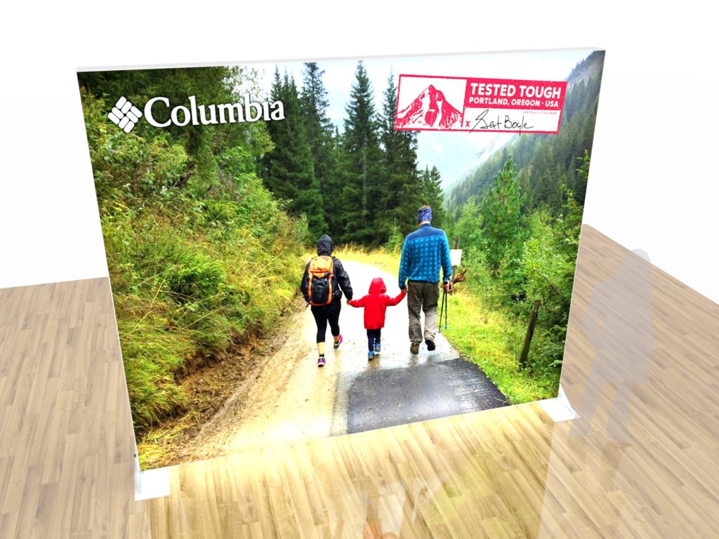
Photos should be high resolution or vector, especially for your logo. Always have native, clean artwork for projects. This is critical! Spend the extra money to get good quality stock photography. It’s not that expensive and can make a HUGE difference in your booth. This isn’t a billboard — people will be walking up and even touching your graphics.
Nothing makes a graphic designer cringe more than being handed a business card and asked to pull a logo from it. If you worked with a designer to create your corporate identity, ask them for the native files. You may not be able to open them, but that doesn’t mean your designer won’t be able to. It’s why you hired a professional in the first place, remember?
5. The Devil is in the Details.
When possible, ask your designer to place your graphics on a virtual rendering of your display. You may discover a few surprises. Sometimes the physical booth affect the flow of your graphics which you won’t know until you see them. For example, accessories like shelves, monitors, and counters can block or obscure key graphic elements. Exact measurements are critical.
All too often, graphics arrive, and they look amazing, vibrant, and perfect . . . until you realize that the monitor cuts off half of your logo. Seeing the graphics rendered will help prevent mistakes. Having to reprint graphics because of an error that could have been caught earlier is frustrating, expensive, and stressful. The expression, “measure twice, cut once” is just as important to graphic design as to carpentry.
6. Create a Flow.
Sometimes exhibitors have a million ideas they want shared about their products or services. Just because your display has four different graphic surfaces that doesn’t mean that you should treat them as such. Make sure your graphics tell a coherent story. If you want each of your four products featured, one on each panel, that’s fine. Find a way to tie them together. Make sure that the color scheme and design as well as your copy works together. Don’t re-invent the wheel with each panel. You want the overall design to be cohesive — not confusing.
7. Color is Your Friend . . . or Your Enemy.
Color matching can be especially tricky for modern trade show exhibits. Printers are printing on fabric and various direct print surfaces and some fabric graphics are backlit and others are not. So, how do you get your colors perfect?
Whenever possible, reference specific Pantone swatches when color matching. This makes it much easier for the printer to make adjustments. Trade shows are notorious for being quick-turn projects. No one wants to have graphics shipped directly to the show only to find out that the nice mustard yellow they were expecting printed peach or pea green.
8. Don’t Font It Up.
One or two fonts is enough. Three fonts is pushing it. Any more than that and you’ve got an identity crisis on your hands. Legibility is key with any graphic design but especially graphics that are being viewed from a distance. Look for a clean, easy-to-read type and then if you want a little flare, add an accent font that is distinctive but don’t overuse it.
And please, don’t use a cursive or handwriting font in all caps. Just don’t. As a side note, avoid any fonts with names like Giddy-up.
9. Scale is Everything.
You have the opportunity to create larger than life graphics. Seize the day! Go big or go home. Don’t waste your time designing 20-foot graphics that are only meant to be viewed from two feet away. Think about what you want people to see from three aisles over. Show them something that makes them want to visit you. Your graphics should lure attendees to your booth.
10. Printers and Graphic Designers.
Graphic Designers have their favorite printers for reasons that may not always seem logical. But you need to trust their instincts (and their experience). They know which printers will hit the Pantone colors, which ones excel at fit and finish, and which ones will work with you to resolve issues. They also know which printers are superstars at one-off prints and which ones prefer high volume prints in multiple quantities.
The printing world can be confusing to the novice exhibitor and the lingo overwhelming. Ask questions of course but trust your graphic designer to make the best choice based on quality and price.
Terms Your Trade Show Graphic Design Team Knows (and you should too).
There’s no substitute for speaking the native language. Graphic Designers are no exception. Knowing their lingo will not only win you bonus points, but it will also save you time and money. Here are some basics:
The Page
- Bleed: Allowing a design to go beyond the edge so there is no margin
- Grid: Used to align elements to create consistency
- White Space; The area left empty on purpose to emphasize the other elements
- Gradient: Fading from one color to another or from dark to transparent
- Padding: the space surrounding a graphic or a border
- Margin: The space between a border and the objects outside it.
The Text
- Leading: How lines of text are spaced vertically
- Kerning: Adjusting the spacing between characters in a word
- Typography: Arranging type elements in attractive ways
- Font: A unique collection of characters, punctuation marks, numbers and symbols
The Acronyms
- CMYK: Cyan, magenta, yellow, and black (key)
- RGB: Red, green, and blue
- DPI/PPI: Dots per inch or pixels per inch. Otherwise known as resolution
- UI: User interface, meaning the actual appearance of the design
- UX: User experience or the flow and behavior of the design
The Files
- JPEG/JPG: Best for images with gradients
- GIF: Can be static or animated
- PSD/AI: Standard Adobe PhotoShop and Illustrator files
- PDF: Portable Document Format. Used for printed documents and forms
- PNG: Portable Network Graphics. Primarily for web
Partnering with an Experienced Trade Show Graphic Design Team
As you can see we’re passionate about trade show graphic design. When you’re ready to explore the wonderful world of custom exhibit design – reach out to our team so we can help! Our team has countless years of experience in the trade show world and has a keen eye for trade show graphic design that will absolutely get you noticed.